Customer Usability
This in my opinion is one of the most over looked aspects of any business.
My interpretation of customer usability is getting the customer to use or consume your product. With the recent holidays just passing my wife and I purchased a couple of gifts for each other for the house. We picked up a new vacuum and one of those compound miter chop saws. I know glamorous gifts but something we both want/needed and picked them up on black Friday at ridiculously cheap prices.
Now I mention these two products because as I opened up both packages (Yeah some one is thinking “gifts for both of you, be he opens both hmm…” I use them both and both benefit her too. Really! LOL) anyway as I opened both packages I notice one company got did a very good job about making sure I’m happy with the product and the other not so much.
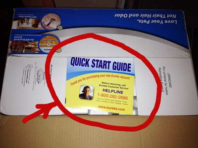
As I opened up the vacuum cleaner your directed which end to open first, and as I opened the first flap I saw the following card that grabbed my attention.
Now I know this doesn’t seem like a big deal but I’m thinking this is pretty smart. Before you even dig into all the pieces to assemble and put together you reassured that help is right there and you know when and where to get it which in my opinion gives you a pretty good feeling about the product.
I do think they do need some help with the copy on the card as one of the first things that caught my eye was “Before returning, call Eureka customer service.” Hmm… I’ve not even touched the product yet and they’ve put into my mind I “might” in the very near future want to return this. I would think something like “If you have questions about assembling or using this product, contact our customer care team at…” “…visit our website at http://…. to watch our free video on how to assemble this product.”
On the other hand as I mentioned the other product, the compound miter chop saw, didn’t even come close. As you can imagine just from the complexity of the name it’s self you could probably guess there are a lot options, adjustments, settings, assembly and such that could be made with such an item.
The small generic manual didn’t even come close! Now I’m sure not everyone that buys one of these is a master carpenter and a little guidance about what some of the levers and settings and operation features would be quite helpful.
As I think about this experience I find there is several things that I could learn from this or even apply to our everyday business. For example if we’re delivering any type of product physical or digital what can we do to improve customer usability?
Right from the point of sale couldn’t we give them a postcard, flyer or even an audio or video explaining what to expect next? “Thank you for your purchase here is our quick start guide on getting the most from our product, how you pick up your product, or when/how it is delivered to you.
After the product is delivered do we provide a follow up to help them consume their product? Many times the customer buys from us and they never hear from us ever again. Something to think about even in the case of the vacuum cleaner, is their consumable parts that may need to be replaced? Filters, belts, etc?
If you had provided getting started material make sure to provide a way to create a followup method. For example, an email address, phone number or even physical address that you could follow up with them and possible give them “opportunities” and reasons why to purchase from you in the future.
As you create your products or maybe you already have products think about what you can do to improve your customer usability. This will be something I will be evaluating further in the very near future.
I had not intended for this to be a 700 word blog post but as the say a picture is worth a million words so all in all it’s relatively short LOL hopefully this gives you something to think about and helps you grow your business further.


What we have found is that the softer a product, we must do something to make it more concrete, hard, if you will and the harder a product, the more we must make it soft. We work with chiropractors and patients who visit the office often leave with nothing in their hand except for a receipt. A chiropractic adjustment is truly “soft” as the adjustment is delivered, but cannot be seen. We advocate providing something of substance for the patient to take home, i.e., educational literature. This provides the patient with something to hold on to other than an invisible spinal manipulation.
Lawton, thanks for sharing that, also that is a great example.
Frank,
A great book I recommend is the Customer Experience Revolution (http://www.cxrevolution.com/) by Jeofrey Bean and Sean Van Tyne.
Without over simplifying the book, it’s basically a detailed series of case studies on companies that deliver exceptional customer experience / value. Companies like Apple, Amazon, Starbucks, J.D.Powers and many more.
Sean Van Tyne is a fellow member of the Orange County Product Managers (www.ocproductmanagers.org); a Product Manager association I belong to and I have had the opportunity to see his work. The book is a must read and is relevant to the topic of this blog post. Hope this helps.
Much success!