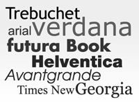
Website Mistakes – Using to many fonts
 Font Overkill
Another issue I see web site owners make is in the use of fonts.
This is a case where less is more, meaning just pick one or two fonts of the same style and stick with it.
What I’m referring to by “same style” is this; there are “Serif Fonts” and “Sans Serif Fonts”. Sans is French for without. So Sans Serif means without the Serif or without the extra brush stroke at the end of each stroke of the character. You may have seen on some characters in certain fonts a little tag on the end of each letter. In script or calligraphy it is the extra stroke at the tips of the character.
Examples of Sans Serif fonts would be Times New Roman, Century, Georgia, & Courier. Examples of Serif fonts would be Arial, Tahoma, & Verdana. There are many others in both font family but I’ve listed these because they are common fonts you see online.
For printed material most studies show that Sans Serif fonts are best for readability but for the web it is the complete opposite. Testing has proven that Serif fonts are much easier to read online.
Most of the successful marketers that I know and follow prefer Tahoma for headlines and subhead lines and utilize Arial for the body and navigation.
There are a few cases where crossing the style border is acceptable and that would be when adding testimonials or case studies to your web page. The reason for doing this is that you would want to differentiate between the regular or main copy and these special callout sections.
This is all based off of what I have seen in my circles online and what causes reaction from your web site visitors may be different. That’swhy you should always test everything.
I hope you’ve found this information useful.
All the best and much success…
Frank Deardurff – That One Web Guy!
